From Sketch to Symbol
This project documents the logo design process for a local community cornerstone: The Ledge.
Located in the heart of the Spring Creek community in Jackson, Tennessee, The Ledge is a non-profit gathering hall for faith, family, and flourishing. My goal was to capture that spirit of “elevation” and translate it into a symbol that feels as timeless.
1. Surveying the Site: Understanding the Role
Every effective logo design process begins with listening. Before I touched a pencil, I spent time with the staff to understand their “Four E’s”: Education, Enrichment, Entertainment, and Events.
We needed to bridge the gap between rural history and future growth. I anchored the design in five core values: Faith, Family, Community, Preservation, and Growth. This wasn’t just a checklist; it was the mortar that held our creative decisions together.
2. The First Cut: Sketching & Symbol Exploration
I believe in the friction of lead on paper. This stage is intentionally raw. Sketching allows ideas to breathe before the rigid lines of software take over. I explored abstract shapes and literal emblems.
Many ideas were left on the cutting room floor. We searched for a symbol that could represent an individual’s leap of faith and the collective strength of a community.
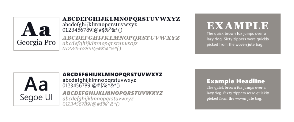
3. Selecting the Grain: Typography Direction
A logo’s “voice” is found in its type. For The Ledge, the letters needed to be sturdy enough to be read from a passing truck on Highway 70, yet warm enough to welcome a neighbor.
I chose Georgia Pro, a classic serif that whispers of tradition and heritage, and paired it with Segoe UI. This contrast between the old-world serif and the clean sans-serif mirrors the mission of The Ledge: honoring the past while equipping the next generation.
4. Digital Refinement & The Feather
As we moved into the digital workshop, the logo design process shifted toward a “vintage-artisan” aesthetic. We moved away from a literal dove and focused on the feather.
A feather is a tool for writing and a miracle of engineering. Alone, it is delicate; together, feathers grant the power of flight. This became our central metaphor for Spring Creek—individuals coming together to help the community take flight. I refined the curves and “tension” of the feather to ensure it felt intentional and balanced.
5. Applying the Finish: Color Exploration
Color should never be used to hide a weak design. I perfected the mark in black and white first to ensure it would work on everything from heavy-duty signage to a simple tax-deductible receipt.
For the final palette, we chose tones that evoke a “vintage-modern” feel—colors that feel settled-in and welcoming.
6. The Final Mark: Built for Every Use
A good tool must be versatile. Because we leaned into a detailed vintage style with banners and flourishes, I provided a “simplified” version of the mark alongside the primary logo.
In the logo design process, functionality is king. This secondary mark ensures that whether The Ledge is screen-printing t-shirts or engraving a small wooden plaque, the brand remains clear, legible, and proud.
Why This Process Matters
Design is simply structured problem-solving. By showing the logo design process, I want you to see that your brand isn’t a result of guesswork—it’s the result of craftsmanship. If you are building something meant to last, the foundation matters most.
Interested in Building Your Brand? If you need a logo, brand identity, or a digital presence built with intention and heart, contact Pixel Chisel today. Let’s pick up the tools and build something together.